How to Apply Colour Theory in Premiere Pro
You’ve learned how to implement the best camera settings for video and filmmaking, shot some epic clips and edited them into a cinematic masterpiece. As you watch the video back, you realize the scenes look a little dull and could use a bit of colour grading. But, for many videographers, the idea of colour grading can be a bit intimidating. Sure, it’s simple to boost the saturation in your clips to make the colours pop more, but actually transforming a scene into something that is both bold and represents your unique style as a filmmaker can be a challenge. But it doesn’t have to be.
There are many different techniques you can implement when colour grading your footage. This article doesn’t attempt to cover all of them. Instead, it attempts to show you how you can apply colour theory in Premiere Pro so that you can make informed decisions as to how and why you might wanter to alter certain colours in your videos, and how those alterations can instantly make your footage more cinematic and distinct. You could certainly drop a LUT, which is basically a filter, onto your footage. The problem with LUTs is that they typically mimic other creators’ styles. They also, in my opinion, limit your creativity, as they make it easy for creators to just toss a specific style onto their footage without developing their own style - which is what will make you truly stand out as a filmmaker in the long run.
Once you gain a general understanding of colour theory, as well as how you can easily apply colour theory in Premiere Pro, you will be creating videos with a vivid, unique style in no time. But first…
What is Colour Theory?
Colour theory is essentially how different colours, or colour combinations, affect our emotions and perception when we view them in art. Colour theory can be utilized in anything from paintings all the way to photography and, of course, videography. In fact, some of your favourite movies likely implement colour theory without you even knowing it!
Generally, there are three recognized ways to use colour in your art. The first one is complimentary colours, which are the two colours opposite each other on the colour wheel (think orange and teal, red and green, etc.). The second is analogous, which is the use of multiple colours that sit side-by-side on the colour wheel. The third is monochromatic, which is when you use only one colour in an image, but multiple shades of it.
To learn more about colour theory, check out this related article where I dive deeper into how colour theory works through the medium of photography.
Why You Should Apply Colour Theory in Your Videos
As noted above, certain colours, and combinations of colours, can invoke a specific mood or feeling when applied to videos. Take, for instance, a video of an epic beach destination. If the colour palette is super cold looking, the beach likely won’t seem that appealing. When a warm colour palette is applied to the same scene, however, the natural warmth of the scene is drawn out, helping create more of that longing to be in a warm beach destination. So, as you start to foray into the art of colour theory in your videos, really try and determine the emotion and feeling you’re looking to invoke and portray in your videos.
Colour theory is also a great way to develop a personal style for your videos. Certain creators like working with specific colour palettes. This colour consistency helps make their videos stand out and become instantly recognizable as their work. Drawing back to the previous paragraph, try and figure out if there’s a certain emotion, feeling or look that you want your overall body of video work to exemplify. And then start experimenting by editing your video within that palette. Not every video needs to be the exact same colour scheme, but, if you find a colour palette that really works for the style you’re after, you can develop sort of a base colour style and tweak your videos from there.
Ready to learn how you can start applying colour theory to your videos in Premiere Pro? Here are two simple steps to get you going:
Step 1: Adjust the Hue vs Hue Curve
After you’ve made some basic adjustments to all of the clips in your video, ensuring that they’re all properly exposed, you’ll want to create a new Adjustment Layer. To do this, click on File > New > Adjustment Layer. Drag the adjustment layer onto the timeline above all of your video clips, and then extend it so that it covers each one. Any adjustment you make to the adjustment layer will now affects all video clips underneath it. Please note, I have not used an adjustment layer in the example images below, as I was only editing one video clip.
With the new adjustment layer selected, open Lumetri Colour, and then head to the Curves tab. Locate the Hue vs Hue section. This section let’s you tweak the colour, or hue, of the existing colours within your video clips. The best way to alter one specific colour is to create a point on the curve by clicking on the specific colour you’d like to change, and then create two more points to the left and right of your initial point. These two extra points will ensure that none of the other colours in the video will be affected by how you alter the one colour you’re trying to change. Then you can drag the original point up or down to change the colour within your video.

For example, if you were trying to change your reds to be more orange, you would create a point on the red portion of the line, add a point on either side, and then drag the point upwards until you reach an orange level. All of the other colours in the video would remain the same, except your reds would now be more orange.
Now, this is the fun part. Sure, you can change specific colours within a video by using the method above, but you can also apply pretty stylish colour palettes by expanding on the same ideas. All you need to do is create more curves on the hue vs hue line.
For example, if you wanted to create the classic orange and teal look, which is a very common colour palette in action movies, you’d start by creating a number of points around the red, purple, yellow and / or green sections of the hue vs hue line, and then drag them each slightly towards orange until you’re left with a C-curve. In the example below, I have dragged the purple and red hues towards orange. Next, you could create a number of points around the aqua, blue and / or green colours, and drag those towards teal, creating a second C-curve.
By shifting your reds, purples, yellows and / or greens towards orange, while also shifting your aquas and blues towards teal, you’ll have effectively created a complimentary colour scheme in all of your clips. If you compare the preview video clip in the first example image to the one below, you’ll notice that the water in the first video clip is almost green and that there are a ton of different colours present in the beach umbrellas, while, in the second image, the water has shifted to a blue hue and the umbrellas are all now blue and orange.
This same concept works for the other colour schemes noted above, such as analogous and monochromatic, as you would just need to create different curves on the hue vs hue line. For instance, if you wanted to create a monochromatic orange look, you would need to create points all along the line and shift all of the colours towards orange in the video.
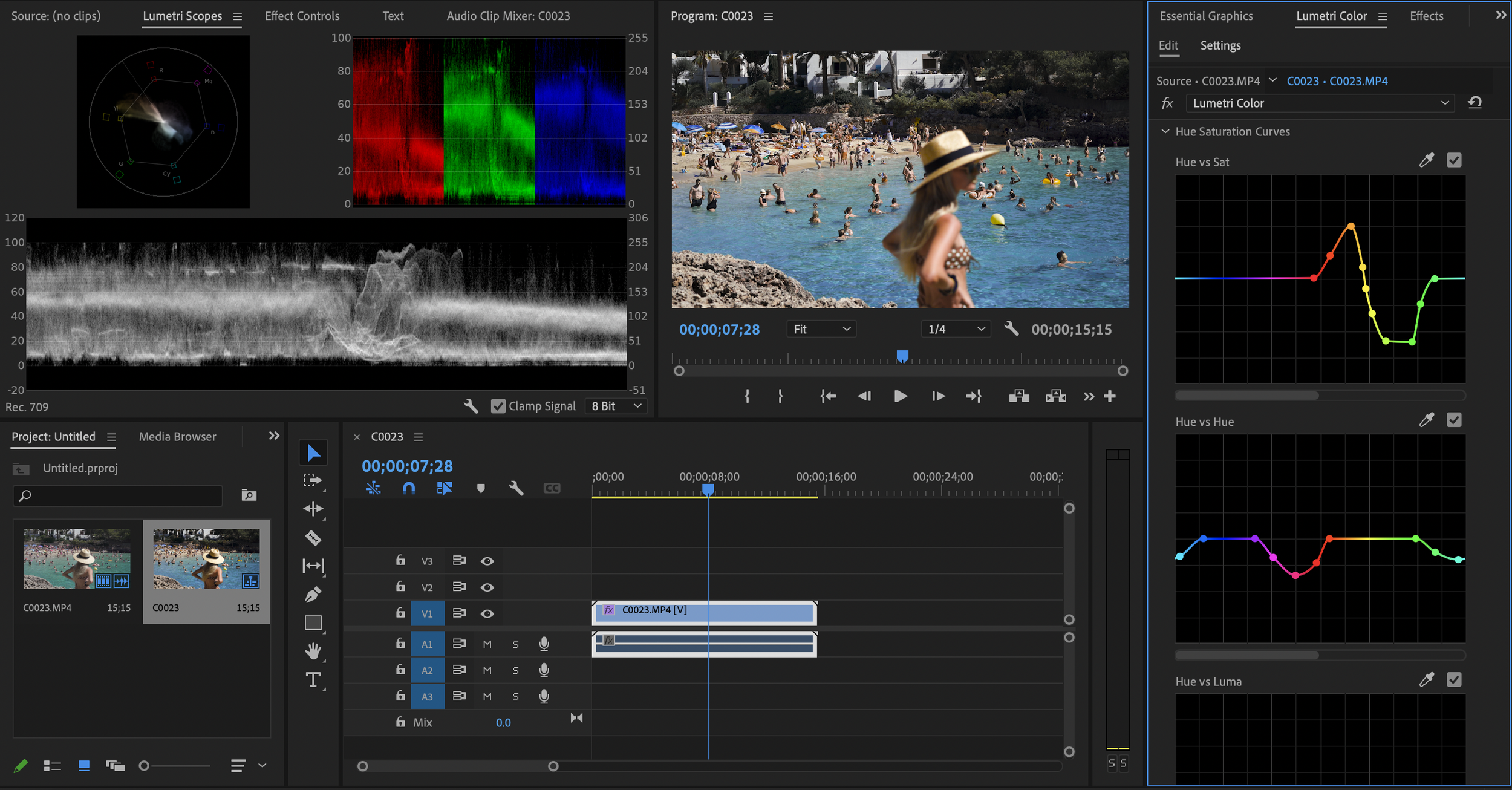
When altering the colour in your videos, though, make sure you try and avoid altering the skin tones. In certain scenes where a coloured light is hitting a subject’s face, this may be less relevant, but, in other scenes, try to keep your skin tones as real as possible. The easiest way to ensure you’re not affecting the skin tones is to select the eyedropper tool and click on the skin tones in your image. Premiere Pro will automatically make three points on the hue vs hue line around those colours. Just make sure to leave those colours flat on the line! As you can see in the example image below, the skin tones are in the orange colour range, so the orange area on my Hue vs Hue curve hasn’t been moved from the baseline.
Step 2: Tweak the Hue vs Saturation Curve As Needed
Once you’ve altered some of the hues in your video, you may notice that other colours now don’t mix with the colour palette you’ve introduced into the frame. You could always alter those hues more towards your colour palette, but, by changing certain colours within an image, you may make certain elements look unrealistic.
For instance, if you are going for a teal and orange look and you shift your greens towards orange, your trees will all start to appear as if they have fall foliage. This won’t work if your scene was taken during the summer!
So, instead of altering the hues of every colour using the method above, what you can do is leave certain colours as is, but desaturate them a bit so they’re less noticeable in the frame.
Using the tree example above, you could first locate the Hue vs Sat section in the Curves tab. Next, use the eye dropper to select the green leaves in your video and isolate that colour, creating three points around it on the Hue vs Sat chart. Then, simply drag the middle point down, desaturating that colour throughout your clip (or video if you make these changes on the adjustment layer). And, just like that, any colour that doesn’t fit into the colour palette you created in the Hue vs Hue section will be de-emphasized, helping your new colour scheme really shine throughout your video.
You can also use the Hue vs Sat curve to make sure the colours you want to pop in your image really do POP. In the example images above, you can see the blue water is already very vivid, however the oranges in the sand and rocks are fairly dull. To help make the oranges stand out better, I’ve boosted the saturation of the oranges and reds, helping to really create a teal and orange colour palette. I’ve also desaturated some of the greens to ensure nothing takes away from that teal and orange colour palette.
Conclusion
One of the best ways to make your videos stand out is to create a feeling and emotion in your viewers. And one of the best ways to create a feeling and emotion is to apply colour theory to your videos using Premiere Pro. To do this, you first need to determine which colours you’d like to utilize and emphasize in your video. Then, you can create an adjustment layer over all of your video clips and tweak the various hues within your video using the Hue vs Hue curve. Finally, you can eliminate, or emphasize, certain colours in your video by adjusting the Hue vs Sat curve. Once you’ve completed those simple adjustments, you’ll have developed a video look that truly creates emotion in your viewers, and also helps you build your personal videography style.