How to Apply Colour Theory in Photography Using Adobe Lightroom
When we see famous photographers and influencers post photos on social media, we may be left wondering how exactly they create images so striking and bold. You likely already know how to do some basic photo editing in Adobe Lightroom like many of today’s best photographers, and you may even be using the best export settings in Lightroom for social media to ensure your images are as high quality as possible, but, for some reason, your photos may still seem not as vivid or captivating as other photographers leading the way. While it may seem like the best photographers out there are harnessing some secret Lightroom setting that only they know how to use, they’re actually a lot of the times using a technique that is standard in a lot of different art forms. They’re just simply using Lightroom as the tool to implement that technique. And that technique is, quite simply, colour theory.
So, what exactly is colour theory? Colour theory is essentially how different colours work together, and how different combinations of colours create emotions or feelings in the viewer.
For example, orange can create a sense of energy and happiness, while blue can create a sense of calming. Green tones can invoke a sense of the natural world, while red can represent passion or anger.
The Colour Wheel
Though each colour invokes a different emotion, the real art of colour theory is how we utilize different colours to create a certain dynamic and experience when viewing an image. You may be familiar with the colour wheel, as most people, at some point or another, see it in an art class while growing up. While the colour wheel may have seemed like a silly gadget at the time, it actually, quite simply, provides an easy guide for colour theory that can be applied to all sorts of art forms.
Complimentary Colours
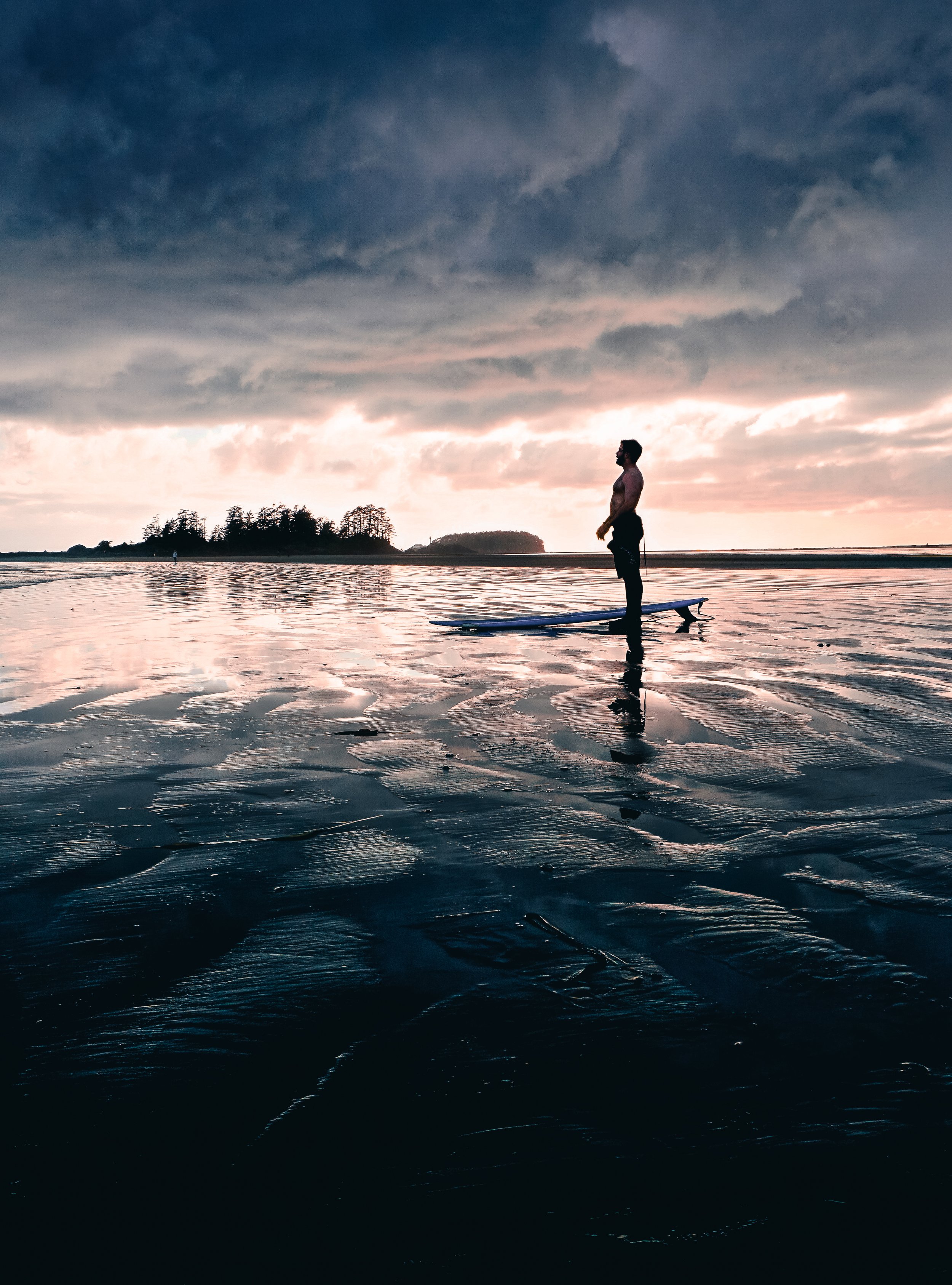
If you look at a colour wheel, you will notice that each colour has another colour directly across from it. These are called complimentary colours. A very common use of complimentary colours in both photography and videography is orange and blue. You may have heard (or likely seen) the “teal and orange look.” This is simply two complimentary colours working in tandem in an image, creating a specific look and feeling. As you can see in the photo above, the darker areas, such as the upper portion of the clouds, have a dark blue colouring, while the lighter areas of the sky and the reflection on the beach are orange.

Monochromatic Colours
Monochromatic colours are simply the use of one colour in an image. The image can utilize multiple different shades and tints of the same hue, but it must be primarily made up of the same hue throughout. The most common example of this is a black and white photo, as it contains varying shades of grey across the entire image. This can be done with any colour, however, and can be particularly impactful if you are trying to convey a very specific emotion in your image, as discussed above. As you can see in the photo example, the same orange hue is present throughout the image’s shadows, midtones and highlights.

Analogous Colours
These are the colours that sit next to each other on the colour wheel. Think about the yellows and the greens, or the blues and the purples. These colour combinations work well together, as they are fairly similar, but do offer a degree of tonal range. Unlike monochromatic colours that use the same hue throughout, analogous colour images allow you to incorporate a bit more variety of colour, while keeping a similar tonal look. In the image above, all of the colours used are very similar, however there is a mix of varying yellows and oranges, providing a bit more colour depth than a monochromatic image, while still maintaining a very unified look.
Applying Colour Theory in Photography in Camera
Now, colour theory is fairly straightforward when painting a picture, as the painter is in full control of what paint colours they use. In photography, it’s a little bit trickier.
As you’ve probably noticed, most scenes have tons of colours in them, making this whole concept of colour theory quite tricky in photography. Once you have a general understanding of colour theory, along with the colour combinations you want to utilize, you can start to find natural scenes that actually follow colour theory quite well. This, of course, makes the post production process quite simple, as you are essentially creating the colour theory look in camera.
Even when you are able to find an example of colour theory in nature, you may be surprised when you drop it into Lightroom that there are, in fact, other colours in the frame that you didn’t think were there. Take green leaves, for example. They are of course green, however they are also made up of quite a lot of yellow and, depending on the lighting, can even contain aquas and blues. That’s a lot of colours for what we thought was simply green!
So, how can we apply colour theory in photography when it is very hard to control the colours of our scenes in camera? That’s where Adobe Lightroom comes into play.
Applying Colour Theory in Photography using Adobe Lightroom
You may be surprised to find out that you can actually implement colour theory on pretty much any photograph using Lightroom. Yep, even the rainbow-looking multi-colour shots you took that don’t follow any form of colour theory. There a number of different ways to implement this in the program, however I’m going to focus on the two functions that I mostly use for implementing colour theory: the HSL Colour Mixer and the Color Grading Panel.
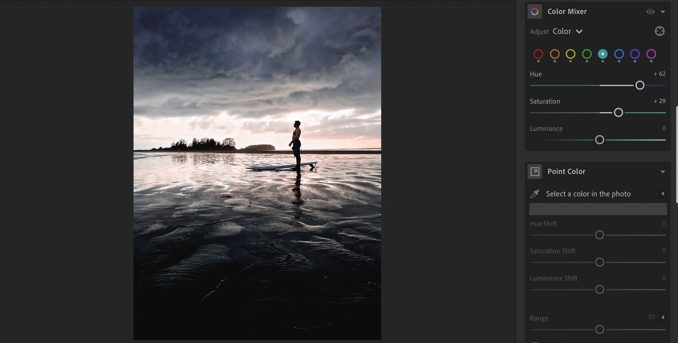
HSL Color Mixer
The HSL Color Mixer essentially allows you two tweak the hue, saturation and luminance of all the colours in your images. This means that you can not only change the hue of a specific colour in the image to match the colour combinations your after, but also eliminate colours that you don’t want in your shot.
Using the Teal and Orange look as an example, the first thing you could do to achieve the look is simply start desaturating some of the other colours in your image that don’t fit that colour combination, such as the greens, reds, purples and pinks. Be careful not to desaturate them too much, however, as you will end up with black and white areas of your photo. I’ve found that, by desaturating some of the unwanted colours to a degree (around -40), you still retain a natural look in the image, while muting those unwanted colours enough where they don’t interfere with your main colour combination.
Next, you can start to actually tweak the hues of some of the colours to better suit the colour combination you’re after. For instance, if your shot has a lot of greenery in it, you can slide the hue sliders for both the greens and the yellows towards the left, which will create more of an earthy orange tone in the foliage, further adding orange to your teal and orange look. And, if you really want the sky and other blues to become more teal, you just simply slide the blue slider slightly more towards teal.
In the screenshots below, I am trying to achieve the classic orange and teal look. You can see that I have boosted the oranges in the photo, and shifted the aquas more towards the blue hue and boosted their saturation. I did, however, decrease the saturation of the blue a little bit, just because the original blue hue was a bit overwhelming. This isn’t pictured, but I also reduced the saturation of any other colour in the photo that doesn’t work with the orange and teal look.
As you can see, with the oranges boosted, a shift in hue for the aquas, and the desaturation of any other colours, the image has a nice blue and orange complimentary colour vibe.


Adjusting the hue, saturation and luminance of each colour takes a bit of practise and really comes down to your own personal taste. Like most things with photography editing, though, it’s better to do it conservatively first before making major adjustments. Especially when it comes to colour.
A word of caution with skin tones. While implementing colour theory in Lightroom is fun, you need to be careful that you don’t make your skin tones look unrealistic. No matter the colour combination, if people are in the frame, prioritize making their skin look natural. Keep in mind that the orange colour primarily affects the skin tones, while the red, yellow and pink colours can also play a role.
Color Grading
Once you’ve tweaked your image’s individual colours using the HSL Color Mixer, you can actually take your colour combination implementation up a notch. The colour grading wheel essentially allows you to add a specific colour to the shadows, midtones and highlights in your image. This used to be called “Split Toning,” which lends itself nicely to the idea of complimentary colours and analogous colours, as it allows you to split various colour combinations across an image.
Sticking with the Orange and Teal Look example, to achieve this look in Lightroom, you’d introduce a bit of blue/teal into your shadows, along with a bit of orange into your highlights. To do this, you’d simply drag the circle in the Shadows wheel towards the blue side of the wheel. The closer you drag it to the edge of the circle, the more saturated the colour in the shadows will be. Then you’d drag the circle in the Highlights wheel towards the orange side of the wheel. Again, keep this conservative. You don’t want to saturate your highlights or shadows too much, as your image will start to look like an orange and teal mess. You want the effect to be very subtle. If you have clouds in your image, they should have a bit of a warm glow, while your shadowed areas will have a more blue, cooler vibe.
As you can see if you compare the final image below with the version of the image shown above for the HSL Color Mixer example, the orange and blue complimentary colour combination is a lot more vivid and vibrant now.
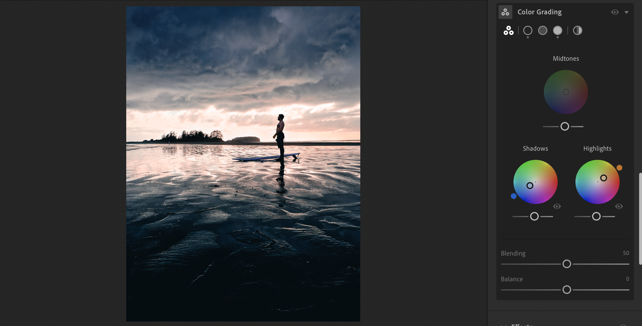
You can further adjust the split of these colours by sliding the Blending and Balance sliders below the wheels. I generally leave the blending slider as is, but, depending on the photo, I will sometimes adjust the balance. The balance essentially lets you control what colour in your colour grading setup is more dominant in the photo. If you leave it at 0, both the orange and teal will be equally balanced. If you slide the balance around, you will end up with a more dominantly orange photo or a more dominantly teal photo.
Conclusion
The examples used throughout were for the classic orange and teal look, however the HSL Color Mixer and Color Grading panel can be used to create any colour combination, and can also help you create images using complimentary colours, analogous colours and even monochromatic colours. With most things in photography, applying colour theory in photography using Adobe Lightroom takes time, but it can truly make your images stand out and create a real sense of emotion in your shots. They key is to mess around with the software, find a look that suits you, and share your work for the world to see!